
Improving New User Retention on BeReal
Project Overview:
A UX research and design project focused on improving BeReal’s first-time user experience and long-term engagement without losing its core authenticity. By studying both new and former users, the project uncovers why engagement drops and identifies design opportunities to help new users become loyal ones.
Project Context
Part of a graduate-level course project during my Master of Fine Arts in Design Research and Development at The Ohio State University.
Team:
Individual project for a graduate course
My Role:
Led the project end-to-end, including research planning, participant recruitment, qualitative and quantitative analysis, ideation, concept development, prototyping, and user testing.
Tools & Methods:
User Journey Mapping, Persona Development, Focus Groups, Concept Testing, Competitive Analysis, UX Criteria Scorecard, Surveys (Qualtrics), Quantitative & Qualitative Analysis, Figma (UI Design & Prototyping), Miro (Collaboration & Ideation)
What is BeReal?
BeReal challenges the norms of social media and promotes authenticity by inviting users to share spontaneous, unfiltered moments
BeReal is a social media app created in France in 2020. Once a day, it sends users a notification at a random time. They are asked to take and share a photo using both the front and back cameras within two minutes.
The goal is to show real life as it happens, without filters, edits, or retakes.
Unlike apps like Instagram or TikTok, BeReal does not use algorithms, likes, or follower counts. It encourages more honest, personal sharing with close friends instead of performance for a large audience.
With its simple format and focus on authenticity, BeReal stands out in a crowded social media landscape.
This project looks at how new users respond to that experience.

Need & Problem
The promise of authenticity draws new users in, but the social media experience struggles to keep them coming back
BeReal offers a refreshing take on social media by encouraging real, unfiltered sharing, which attracts many first-time users curious to try something different. Based on my own experience, I noticed that while people are initially excited, many stop using the app after just a few posts.
To understand this pattern better, I conducted desk research and reviewed over 200 online reviews. A clear insight emerged: users often stopped using BeReal when their friends weren’t active or left soon after joining. Without friends, the experience felt incomplete, highlighting that the app’s value depends heavily on shared participation rather than solo use.


Research Direction
Improving the experience for new users by learning from both new and former users
This project focuses on improving the experience for new users, but it also studies former users because they were once new users themselves. Understanding why their engagement dropped provides critical insight into what prevents new users from becoming loyal ones. By combining behaviors and feedback from both groups, the goal is to uncover design opportunities that support long-term use.

Survey
Using survey insights to uncover what potential users expect from BeReal before their first experience
I surveyed 15 participants who had never used BeReal to understand their mindset before trying the app. The survey explored:
-
Their current social media habits
-
What frustrates and motivates them
-
What they expect from a more “authentic” platform
-
Their expectations for using BeReal
-
How they feel about sharing unfiltered, real-time content
These responses helped me understand their perspective going into the BeReal experience and informed the persona archetypes in the next step.

Persona Archetypes
Highlighting three archetypes of potential users based on survey findings to reveal motivations, pain points, and expectations before trying BeReal
From the survey responses, I identified three persona archetypes based on patterns in social media habits, motivations, and expectations. All three represent people who have never used BeReal, highlighting how potential users view the app before trying it. These archetypes provided a framework for understanding different user mindsets and guided how I approached the next steps of testing and design.

Competitive Analysis
Learning from the Competition: How Other Apps Turn New Users into Loyal Ones
In this step, I examined how other social apps keep new users engaged long enough to become loyal ones. BeReal has chosen different core values as a social media platform, which makes it challenging to compare directly with platforms that prioritize different goals. However, it is still important to analyze these competitors to understand the features that drive their engagement and to evaluate which, if any, could be adapted without compromising BeReal’s principles.

New User Testing Phase
Creating a 10-day test period to let participants experience BeReal as new users before the focus group
I asked 5 participants to use the BeReal app regularly for 10 days. BeReal is a social platform that relies on having friends to see and share posts, so I asked the participants to add me and each other as friends in the app.
These five participants were already friends in real life, which made them more comfortable sharing their daily posts with each other and created a more natural first-time user experience to discuss in the upcoming focus group.

Focus Group
Using interactive activities to uncover real first-time user experiences and evaluate current features for new users
After the 10-day usage study, I conducted a focus group with the same 5 participants to explore their first-time experiences in depth. The session combined structured activities and open discussion to reveal motivations, pain points, and perceptions of BeReal’s features.
Focus group steps:
1. Good vs. Bad Past Experience Warm-Up: An icebreaker where participants shared good and bad social media memories to get them thinking from multiple angles.
2. Feature Mapping: I separated BeReal’s main features on a board and asked each participant to rate them using color-coded face stickers that represented different emotions. This made their perceptions easier to capture visually. They then wrote a short reason for their choice on a sticky note and placed it alongside their sticker under each feature.

3. Feature Discussion & Experience Exploration: After the ratings and comments, the group discussed their choices, which revealed deeper insights beyond the initial written notes. I facilitated the discussion to help them express more about their expectations from this social media platform and their current pain points.

User Insights
How new users described the highs and lows of their first experience with this social platform, drawn from focus group feedback and online reviews

-
When capturing both sides of reality, lack of control can make authenticity feel “ugly.”
Users liked the dual camera concept but felt they lacked control, resulting in what they called “ugly” or blurry pictures. They suggested being able to see both sides at once or adding a short delay. This raises deeper questions: What defines a “good” or “ugly” picture when sharing daily life, and how are those perceptions shaped?
-
When moments disappear, does it free users to share or frustrate them when timing feels unfair?
Some loved the low-pressure nature of temporary posts; others disliked that late posts vanished sooner. The tension lies in whether ephemerality truly encourages authentic sharing or creates friction when rules feel rigid.
-
A nudge toward authenticity can feel like a demand for compliance.
BeReal’s random notification was disliked, with users comparing it to an Amber Alert due to its tone and black + yellow design. This raises a key question: Is spontaneity being achieved, or lost to anxiety, and how much does tone of voice shape that?
-
If everyday moments feel repetitive, can archiving still feel meaningful?
Many users either didn’t know about Memories or didn’t care because their posts felt too similar. This highlights a question: how can design make archiving ordinary moments feel valuable rather than redundant?
-
Removing follower counts shows how design can shift a platform from performance to connection.
The zero-followers feature was one of the most loved elements. It made users comfortable and eliminated social comparison, proving that small design decisions can set the tone for a friend-centered, low-pressure environment.
-
Without active friends, new users quickly drop off.
Many new users stopped engaging when their friends either weren’t on BeReal or left after a short time. Without an active social circle, the experience felt incomplete, revealing how strongly the platform’s value depends on shared participation rather than solo use.
User Journey & User Flow
User journey mapping across three personas and user flow analysis to identify gaps and opportunities


I created a detailed user journey map based on three persona archetypes, drawing from online reviews, my online survey, the archetypes themselves, and insights from the focus group. The journey map helped me capture how new users think, feel, and move through different stages of interaction. I also created user flows to break down the specific steps and decisions involved in completing key actions.
Together, these two tools gave me a clear overview of the entire experience, helping me identify friction points, missing elements, and opportunities for improvement. This combined analysis guided the next steps in my ideation and redesign process.
UX Criteria Scorecard
Evaluating Early Ideas Through the Lens of Key Personas and Product Values
I generated several initial ideas based on research insights, then used a UX Criteria Scorecard to evaluate them. The scorecard reflected BeReal’s core values and addressed the needs of my three personas, the Overwhelmed Scroller, the Engaged Observer, and the Social Butterfly, by rating each idea on a 1 to 5 scale across six criteria, including support for each persona type, product alignment, clarity for new users, and feasibility. This process surfaced the most promising directions while identifying others to deprioritize.

From Ideas to Testable Designs
Low-Fidelity and High-Fidelity Wireframes transforming concepts into structured flows and polished prototypes for concept testing by users
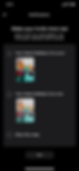
After narrowing down concepts through the UX Criteria Scorecard, I first created low-fidelity wireframes to map the structure and user flow. I then refined these into high-fidelity wireframes in Figma, building them as interactive prototypes that represented the final look and feel. These are now ready for concept testing to validate the solutions and guide future iterations.
Low-Fidelity Wireframes:

High-Fidelity Wireframes:

Concept Testing
Gathering actionable insights from former users through interactive prototype testing
To ensure the concepts addressed real engagement challenges, I tested them with six participants who had previously used BeReal but had stopped. Each concept had its own interactive prototype, built for mobile in Figma, that participants could try directly on a phone. After testing each prototype, they answered focused feedback questions and completed a rating exercise. This process helped identify the strengths of each concept as well as areas that needed improvement or change for the next iteration.

Concepts Overviews and User Testing Insights
Breaking down each concept with the related user problem, proposed solution, and user testing insights:
1. BeReal Echo:
Extending post visibility to give users more time to view and interact with friends’ posts


Problem:
Users felt disconnected from the app due to the loud, commanding notification with yellow alarm signs, making the prompt feel more like an order than an invitation. This impersonal approach discouraged participation and created a barrier to forming genuine social connections.
Concept:
-
Users can opt in to let a trusted friend or small group customize their BeReal notifications
-
The friend writes a personal message that replaces the app’s default system alert
-
The customized notification appears as the daily BeReal prompt, making it feel more personal and engaging
Feedback Summary:
-
More time for friends to view posts, making the experience feel less rushed
-
Reduced pressure to check the app immediately
-
Aligned with real behavior of delayed checking
-
Some concerns about straying from BeReal’s simplicity
-
Questions on how posts would be organized over time
Refined concept:
Limit post visibility to 48 hours and relocate viewed posts to a separate section for a cleaner feed.
2. Friend-Customized Notification Prompt:
Letting friends personalize BeReal notifications to feel more inviting and connected


Problem:
Users felt disconnected from the app due to the loud, commanding notification with yellow alarm signs, making the prompt feel more like an order than an invitation. This impersonal approach discouraged participation and created a barrier to forming genuine social connections.
Concept:
-
Users can opt in to let a trusted friend or small group customize their BeReal notifications
-
The friend writes a personal message that replaces the app’s default system alert
-
The customized notification appears as the daily BeReal prompt, making it feel more personal and engaging

Feedback Summary:
-
Felt more appealing and friendly compared to the current loud, impersonal alert (often compared to an Amber Alert)
-
Seen as playful and less overwhelming
-
Some concerns about over-customization conflicting with BeReal’s simple style
-
Some participants noted possible confusion if the custom message sounded like the friend had posted, rather than prompting the user to post.
Refined concept:
Add a gentle default notification when no friends send one, and ensure custom messages clearly show the friend is prompting you to post, not posting themselves.
3. Customized Time Notification:
Allowing users to set preferred time windows while keeping some spontaneity


Problem:
Many users found the completely random BeReal notifications frustrating, especially when they came during meetings, exams, or while sleeping. This often led to missed posts or rushed, less meaningful ones.
Concept:
-
Users can choose a preferred 4+ hour time window or set their awake hours for receiving notifications
-
Most alerts are sent within the chosen period, ensuring they arrive when the user is active
-
Occasional random alerts are sent to maintain spontaneity and authenticity
Feedback Summary:
-
Appreciated having control while keeping some spontaneity
-
Concerns about weakening the shared posting experience
-
Suggested syncing with Focus Time or adding a "Do Not Disturb" mode
-
Worry that users might become overly selective with times
-
Idea for AI to learn personal routines and automate notifications thoughtfully
Refined concept:
Add a third notification timing option that syncs with the phone’s Focus Mode to avoid interruptions and reduce late posts.
4. Memories – Shuffle:
Rewarding on-time posting with a surprise throwback from past BeReals


Problem:
Many new users aren’t aware of the Memories feature, missing its value as a digital memory book. Without prompts or natural discovery, this meaningful part of the app often goes unnoticed.
Concept:
-
Posting on time unlocks a “Shuffle Memory” button
-
Tapping the button shows a random past BeReal from the user’s memories
-
Users can reshare the resurfaced post as a Throwback Post
Feedback Summary:
-
Enjoyed the surprise of resurfaced memories without manual searching
-
Some wanted more control, such as picking from recent shuffles
-
Suggestions to make it available anytime, not just as a reward
-
Liked the randomness for maintaining authenticity
-
Concern about resurfacing painful memories unintentionally
Refined concept:
Allow up to three shuffles with the option to pick a favorite, and add creative prompts that encourage selecting past posts from Memories for a more engaging experience.
5. Dual Snap Delay:
Giving users a brief delay between shots for better framing without losing spontaneity


Problem:
Taking front and back photos at the same time can feel rushed and awkward, especially for new users. Without a moment to adjust framing, the result often feels clumsy or poorly composed, making the spontaneous format more stressful than fun.
Concept:
-
After the first photo is taken, a short countdown (about 3 seconds) appears before the second camera captures
-
The delay gives users a moment to adjust framing without making the shot feel staged
-
Helps preserve authenticity while improving photo composition
Feedback Summary:
-
Improved user experience without removing spontaneity
-
Helpful for beginners learning the dual-camera feature
-
Reduced stress and awkwardness in framing photos
-
3 seconds felt authentic and prevented over-curation
-
Addressed frustration with bad framing or blurry results
-
A few noted a potential learning curve
Refined concept:
Keep the feature for its high satisfaction and engagement potential, but simplify the learning process to make it more intuitive for new users.
6. Personalized Blur & Reveal Invite:
Inviting friends with a full post or a blurred teaser to spark curiosity

Problem:
New users often leave because they don’t have friends on the app. Since BeReal is most engaging when shared with friends, the lack of connections early on can lead to drop-off.
Concept:
-
After posting, users can share their BeReal as either a full image or a blurred version hiding one side
-
The blurred version creates curiosity and encourages friends to join
-
Friends who sign up through the invite can unlock and view the full post
Feedback Summary:
-
Liked the personalized, creative approach to inviting friends
-
Some felt the blurred version could use stronger curiosity triggers
-
A few preferred the original BeReal invite for its showcase feel
-
Suggested linking the invite to an instant photo-taking experience via a website to match BeReal’s spontaneous spirit
Refined concept:
Support personalized invitations with a short in-app video explaining BeReal, making it easier to share and increasing the chance friends will join.
Project takeaways
- Brand values shape every design decision:
Protecting BeReal’s commitment to authenticity meant filtering out engagement tactics that succeed on other platforms but would make it feel like just another social media app. Instead, the goal was to explore smarter, more aligned ways to improve new user retention while preserving its mission to fill a specific gap in the social media landscape.
- Competitive analysis is more than feature comparison:
The real insight came from understanding why a feature exists on a competitor platform, how it shapes user behavior, and whether that behavioral shift would strengthen or undermine BeReal’s experience.
- Design impact varies across personas:
Evaluating ideas through the lens of different persona archetypes revealed that a feature highly beneficial for one group could create a negative experience for another. When a social platform commits to a niche value, it may need to intentionally sacrifice certain personas, accepting that they are not the target audience in order to better serve its core users.
